.png)
Transforming a slow, confusing insurance quoting process into a streamlined, user-centered experience. Learn how a small, focused team tackled complexity, compliance, and speed to improve clarity and confidence for users.
.png)
One of the most impactful projects I worked on at Questrade was leading the design of its first end-to-end insurance quoting experience. Working within a small, focused team consisting of me as lead designer, a UX Writer, and a Project Owner who acted as both stakeholder and industry expert, we dedicated six months almost exclusively to this journey. Our challenge was clear. Competitor quoting flows were slow and confusing, often taking 8 to 12 minutes and losing users due to unclear language, random question order, and decision fatigue from overwhelming options. We set out to design a faster, clearer, and more intuitive flow. The result was a streamlined quoting experience that simplified language, grouped questions logically, and reduced unnecessary choices. This made it easier for users to complete a quote with confidence and provided Questrade with a scalable foundation for future insurance products.
This project carried several unique challenges.

Insurance is a heavily regulated industry. Every question had to meet compliance standards, leaving us with little flexibility in what we could ask but plenty of responsibility in how we asked it.

Leadership wanted the quoting tool live within months, not years. This required us to move quickly while making design decisions that could hold up at scale.

We needed to design an experience that was both user-friendly and aligned with business goals. One early discussion focused on how to make quoting fast without compromising accuracy or compliance. That tension between speed and regulation set the stage for some of the most pivotal design decisions we made.
Despite these pressures, our team had significant autonomy. Leadership offered guidance, but the day-to-day decisions were ours. This ownership allowed us to experiment, test, and simplify a process that had been unnecessarily complex for years.
To ground our work, we began with a competitor review of major insurers to identify common friction points. We walked through five competitor quoting flows end-to-end, timing each journey and noting where we felt slowed down or confused.
The patterns were consistent:
Unclear language in questions that added unnecessary cognitive load
Poor sequencing, with questions appearing at seemingly random points or without logical grouping
Decision fatigue, caused by overly complex answer options, too many free-form fields, or extremely long dropdown lists for simple questions
On average, competitor flows took 8 to 12 minutes to complete and showed clear drop-off risks at moments of high complexity. From these insights, we defined three design principles: simplify language, group related questions together, and reduce unnecessary choice wherever possible. These principles became the foundation for our design work.
Once we had alignment from leadership, including Questrade’s Chief Strategy Officer, on a medium-fidelity flow, we moved into validation. User testing at this stage was not about blue-sky exploration but about pressure-testing the design decisions we had already made.
We ran an A/B/C test to compare different quoting experiences:
Flow A: Our Questrade-designed flow
Flow B: A competitor’s flow that we shortened for simplicity
Flow C: The competitor’s full, unedited flow
This setup allowed us to measure how users responded to complexity versus clarity. Our goal was to confirm whether our decision to simplify by creating shorter questions, clearer groupings, and more natural phrasing translated into a smoother, less fatiguing experience.
.png)
An early theme emerged: speed mattered. Users gravitated toward flows that felt direct and lightweight, even when the underlying questions were the same. This insight became a guiding thread for later decisions, including a pivotal choice that would allow the quoting process to be almost instant for some users.
Building on testing insights that showed users valued speed and clarity, we focused our design decisions on removing friction wherever possible. Two examples highlight this approach: simplifying language to reduce mental load and offering an optional fast-track experience for users who wanted a quote in minutes.
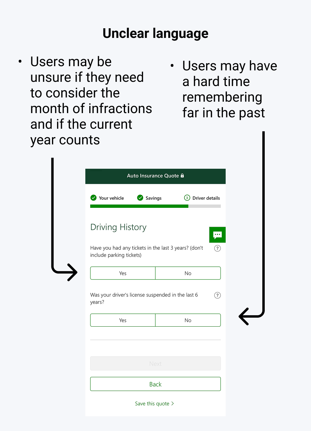
Most competitor flows asked vague, memory-heavy questions such as: “Do you have any at-fault tickets in the last 3 years?” We reworked these to be grounded in real dates, for example: “Do you have any at-fault tickets since August 2022?” This small change reduced unnecessary cognitive load, made questions more concrete, and helped users answer faster with more confidence.
.png)
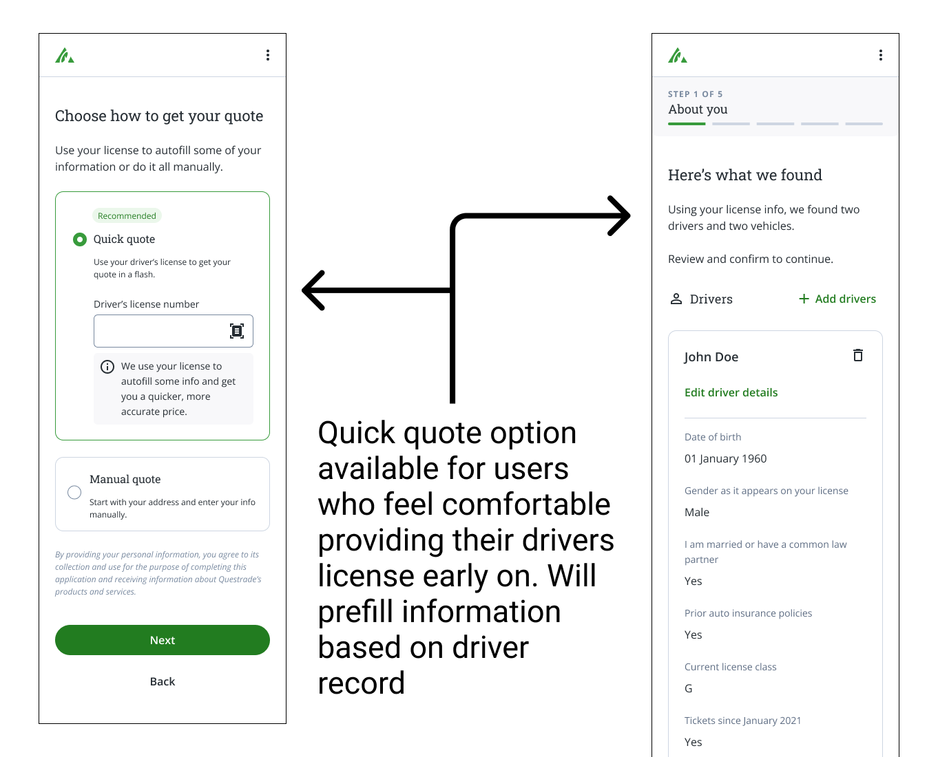
Another pivotal decision was to give users the option to input their driver’s license number. This allowed us to pull their driving history directly and automatically pre-fill many answers. Instead of recalling each detail, users could simply review and confirm. For users who wanted the fastest possible experience, this reduced the quoting journey to as little as 3 to 5 minutes while maintaining accuracy and compliance.
Although the program did not launch due to a strategic shift that ended Questrade’s insurance program and resulted in the entire insurance team being laid off, this project remains one of my proudest experiences. It shows that a small, autonomous team can navigate regulatory complexity, build user-centered flows, and deliver a product that users and leadership recognized as a major step forward.

Reduced time to quote: In usability testing, users who entered their driver’s license number completed the flow in as little as 3 to 5 minutes

Improved clarity: Simplified, date-anchored questions helped users answer with greater confidence and reduced confusion compared to competitor flows

Leadership alignment: The Chief Strategy Officer and insurance leadership endorsed our design direction, showing strong confidence in the UX work

Future potential: While long-term retention and conversion rates could not be measured, market research and competitor benchmarking indicated a strong likelihood of improved outcomes
Even though this project never launched, it remains one of the most formative experiences of my career. Leading the design of Questrade’s first end-to-end insurance quoting journey taught me several lessons:
With a small, focused team, I had the space to own design decisions and develop a stronger design voice while knowing when to seek strategic guidance
Navigating strict insurance regulations alongside an aggressive timeline forced me to simplify complex flows without sacrificing clarity or compliance
Most of all, I left this project with a stronger belief that thoughtful simplification can transform complex, intimidating processes into approachable, human-centered experiences and this is a perspective I carry into every project I work on today.
I'm happy to connect at any time through my email!